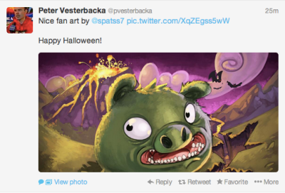
And so it begins. Twitter, now firmly on the road to IPO, has equally firmly turned its attention to monetisation — which means it’s turning on new features that are designed, first and foremost, with advertisers in mind. And with the goal of attracting a more mainstream user-base.
Exhibit A: in-stream photo and video previews on the Twitter web client and Android and iOS apps.
(This being timed to coincide with Halloween is probably not at all coincidental. The disproportionate pull of people dressing up for Halloween on apps and services would make a fascinating study — see also FrontBack recently tweaking its offering so you can compose a shot with two images from the rear camera — thereby enabling users to take lots of shots of other people’s costumes).
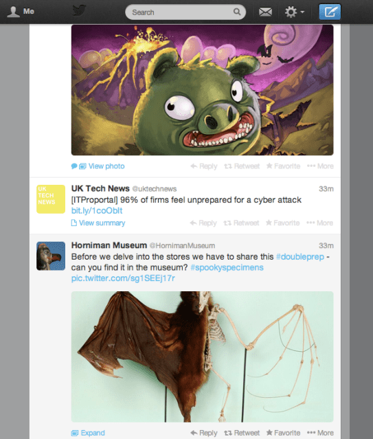
Returning to Twitter, what that means in practice is the densely packed wall of 140-character tweets which allowed Twitter to be an exceptional information delivery mechanism is now being interrupted by visual media.
Pictures, as countless photo-sharing apps prove, draw the eye and the attention. They crowd out words. Which means that the Twitter timeline has become less functional, and more trivial.
Pictures are distracting. That’s why advertisers love them. The big bold image can grab you, even if the product itself isn’t something you’d go looking for yourself. Images by their nature are arresting.
But if your primary product is an information network, then injecting visual media necessarily dilutes the offering.
Literally in the physical space sense. These visual media tweets take up more room than a typical text tweet (unless it’s stuffed with line breaks) — so users’ screen real estate is getting disproportionately hogged by anyone choosing to tweet out Twitter photos or Vine videos.
Obviously, Twitter users should expect vast amounts of visual media to be spewed out by advertisers all too soon — giving them a neat workaround to make an advert stand out in a sea of 140-characters.
Twitter’s core product is also now being diluted. The density of the information conveyed by the timeline is being watered down by whatever random visual imagery your followers are tweeting at any given moment (real-time events like popular TV broadcasts and big sports matches could easily end up overwhelming Twitter, more so than they already do).
It’s not that images and videos can’t be interesting; of course they can. But by forcing users to view media before deciding whether it is worth viewing (i.e. by reading the context provided by the accompanying text tweet before they click on the media link), Twitter is removing a vital content filter from its own network.
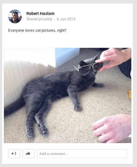
Now, if you’re using Twitter’s web client, there is no opt out of this visual clutter. And that makes Twitter step a little closer to the kind of content you’re forced to eyeball on Google+ or Facebook. So basically:
You can turn off the new media injection ‘feature’ in Twitter’s mobile apps (perhaps for download speed/data conservation reasons), but Twitter has confirmed to TechCrunch there is no off switch in its web client.
At the time of writing Twitter had not responded to a question asking why it is not offering an opt out to users of its web client.
What this means is that if you value Twitter as a fast information resource on your desktop device then the only option is to use an alternative Twitter client such as Tweetbot (which costs £14 on the Mac App Store vs Twitter’s free web client).
(On that point, Twitter has previously limited its API, thereby throttling the growth potential of third party clients, so opt-out options are being limited too.)
In my view, Twitter forcibly injecting media previews is not cool and makes the service less useful to me. But on the flip side — and there is a flip-side — pictures are very accessible, and are more likely to appeal to a mainstream user vs a dense wall of text that needs to be filtered and unpicked on the fly. So it’s easy to see their rational here.
A wall of tweets is great for busy journalists, but likely somewhat alienating for a first time user trying to figure out what Twitter is for. And attracting more users, and more mainstream users, is a key challenge for Twitter — being as it has a growth problem.
Injecting visual media is not the only recent change Twitter has made that tweaks its product to do a bit more hand-holding for newbies and less techie folk, either.
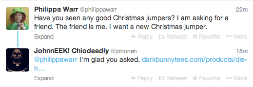
Back in August, for instance, it flipped the format of the timeline by adding a new conversation view that displays @replies in sequence to the tweets that generated them. For seasoned Twitter who knew how to follow the @reply trail, this change was an irritation — because it also dilutes the density of and interrupts the flow of the timeline.
But for newbies it probably helps to generate context on the fly, and also signposts how the service works. In other words: two Twitter birds, one stone.
I recently went through the process of setting my mum up on Twitter, and when you revisit the process of starting again from scratch with zero followers it’s easy to see how hard it is for a newcomer to hook into the service.
A lot of effort is required to ‘get’ Twitter, in terms of finding other users who are tweeting about things you’re interested in. And, unlike Facebook, none of my mum’s peer group is using Twitter. It become evident that a big portion of Twitter’s efforts at the new user sign-up stage are focused on pushing newcomers to follow celebrity accounts, as a way to offer a mainstream way into its service.
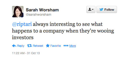
As Twitter prepares to IPO, and becomes answerable to a new influx of investors, it’s inevitable that it’s going to have to find more and more ways to make its service more mainstream. And that’s going to change its core product — in ways that long-time users are going to struggle with.
Add to that, with so much energy and attention still being sucked into photo-sharing services/visual social networks like Instagram, Twitter is evidently feeling a need to diversify beyond text.
Prettying up the timeline with pictures is therefore an obvious next step — it’s just a shame Twitter can’t throw a bone to the subsection of long-time users that value its service as an information resource and give us an opt-out of these mainstream changes.
By all means bury that off switch deep in settings where mainstream users will never find it. But give us an out so we can keep on using the Twitter we know and love.
After all, if we wanted to spend our time idly eyeballing a stream of random eye candy, we’d have long since migrated to Google+…
Similar Articles: Peter Gunz stenographer Sarin gas Kendrick Lamar diss jeff bezos
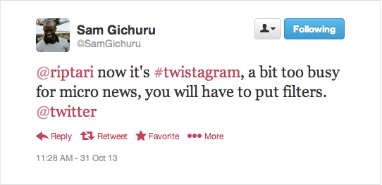

No comments:
Post a Comment
Note: Only a member of this blog may post a comment.